FontSide — Font Discovery Platform
A font discovery platform for exploring, comparing, and pairing 1,500+ Google Fonts through visual similarity and personality-based search.
Making font discovery visual
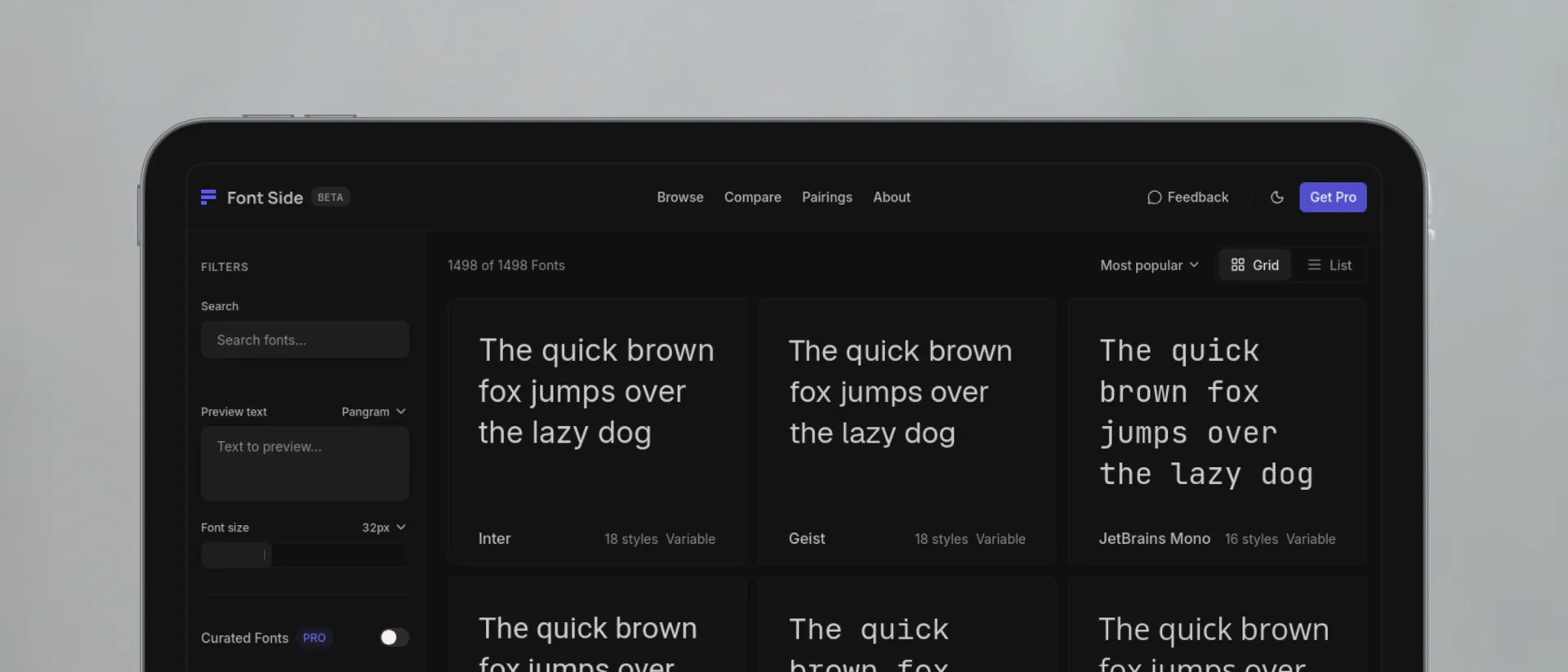
Typographic decisions are visual, comparative, and contextual. Yet most font libraries still treat type selection as a taxonomic keyword search.
I designed and engineered FontSide over eight weeks to explore an alternative: discovering and comparing 1,500+ Google Fonts through four personality axes, computer-vision similarity, and contextual side-by-side specimens.
Why font discovery needs more than taxonomy
Traditional directories categorize typefaces with coarse tags like Serif or Display. But when a design brief calls for a typeface that feels refined, technical, or slightly progressive, keyword filters become less useful. Designers end up opening dozens of tabs to judge subtle differences in stroke contrast, terminal angles, and x-height.
The goal was to align discovery with how designers actually evaluate type: by aesthetic tension, visual similarity, and direct comparison.
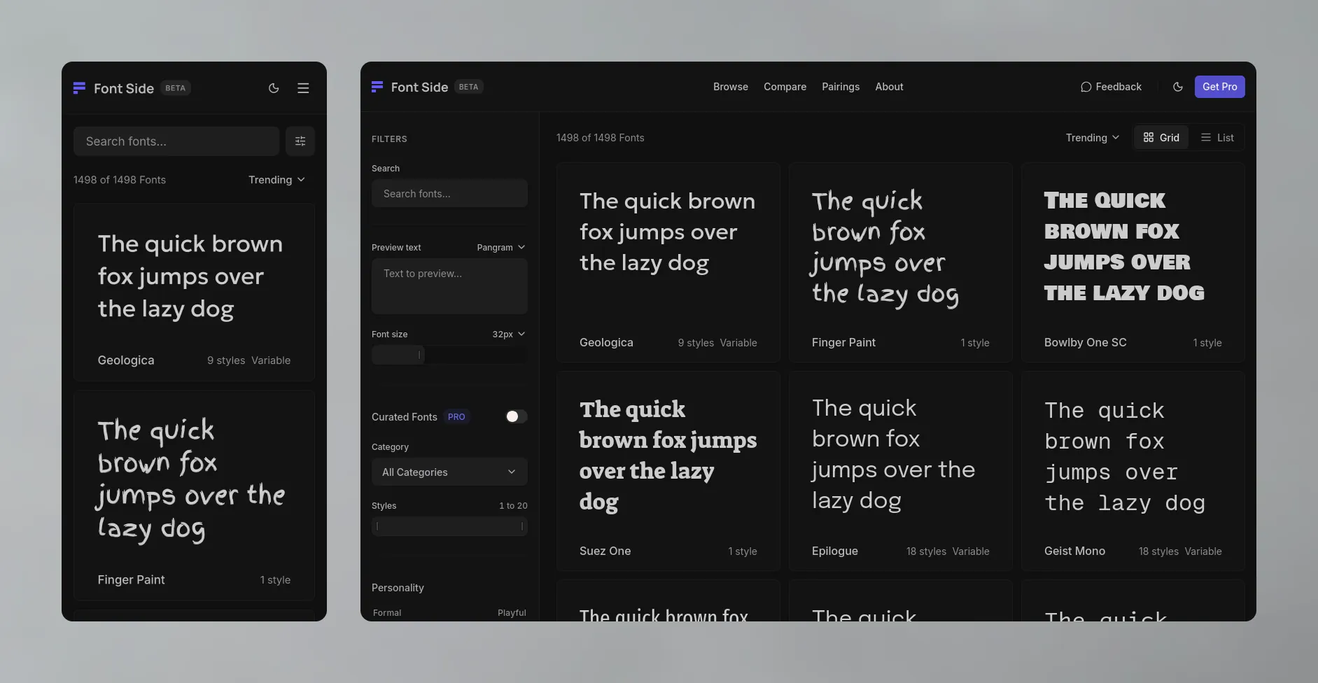
Filter typefaces across continuous visual traits without guessing keywords.
Surface structural alternatives using vector embeddings of rendered letterforms.
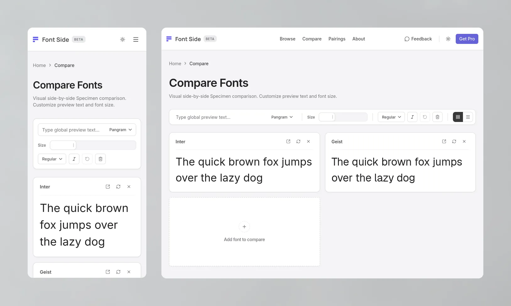
Inspect full specimens and compare typefaces without losing the browsing flow.
Preserving context during exploration
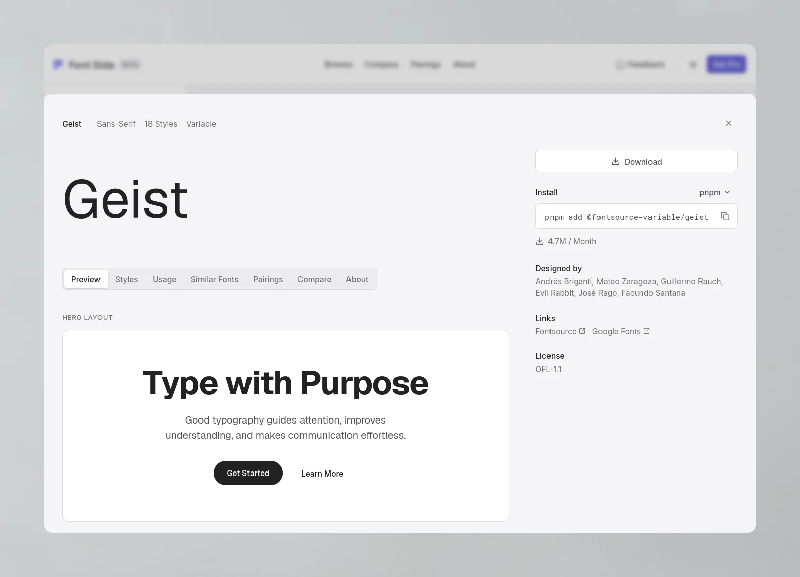
Exploring typefaces requires repeated movement between the catalog and individual specimens. Full-page navigation would reset that context, so I kept specimen inspection in a slide-over drawer and used SvelteKit's shallow routing (pushState) to update the URL without replacing the current page state.
- Preserved context: Active filters, search queries, the comparison queue, and virtualized scroll position remain intact underneath the drawer.
- Deep-linkable: The URL updates to
/fonts/[slug]so individual specimens remain shareable, while direct hits render a full, SEO-indexable standalone page.
Vectorizing font personality with OpenCLIP
The initial personality system mapped Google Fonts metadata tags (e.g. loud, vintage, geometric) into numeric scores. This broke down on edge cases: crowdsourced tags are subjective, binary, and inconsistent across a large catalog.
Rather than manually tuning heuristic weights, I built an offline pipeline using OpenCLIP (ViT-L/14) to evaluate the rendered letterforms directly.
I represented each personality axis as a direction in CLIP embedding space, using opposing typographic descriptions as endpoints. Font embeddings were then projected onto these directions and normalized into 0–100 scores.
The approach separated broad stylistic traits reliably, though subtle distinctions within the same subcategory—such as micro-contrast in neo-grotesque typefaces—remained harder to isolate without dedicated typographic training data.
Isolating typeface anatomy
My first pass rendered a standard pangram ("The quick brown fox...") as the vision model input.
The results were noisy. The model frequently latched onto overall word shape, line density, and paragraph composition rather than the anatomical structure of the typeface—often grouping heavy slab-serifs with bold sans-serifs simply because both produced dense black blocks.
I resolved this by decomposing each typeface into four targeted glyph groups before embedding:
Isolates vertical/horizontal stems, terminal angles, and cap-height proportions.
Evaluates circularity, stroke modulation, and geometric vs calligraphic stress.
Exposes lowercase counters, spurs, and structural lineage (humanist vs grotesque).
Captures spacing density, tracking, and word-level optical balance.
Isolating structural features reduced the influence of visual density and produced more coherent similarity clusters.
Two-tier catalog architecture for instant filtering
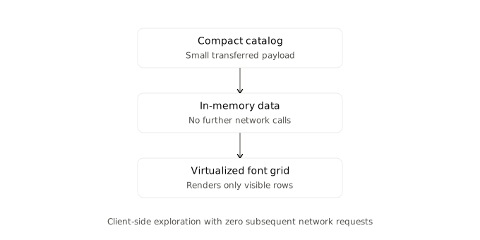
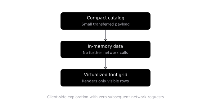
Querying a backend API on every slider tick introduces latency. But bundling complete metadata for 1,500+ fonts into the frontend created a 929 KB payload that slowed initial load.
I structured the data into a two-tier architecture:
- Catalog Index (80 KB): A compact array loaded on initial visit containing only what the grid needs: font ID, style counts, category, and personality coordinates.
- Lazy Specimen Records: Full style manifests, character sets, and similarity graphs load on demand only when a specimen drawer opens.
On the client, re-ranking the in-memory 1,500+ font catalog takes under 5ms within a Svelte 5 $derived rune, without subsequent network requests.
Outcome & Engineering takeaways
FontSide shipped publicly after eight weeks, bringing together personality discovery, visual similarity, interactive specimens, comparison, and font pairings across 1,500+ Google Fonts.
Two architectural choices proved most valuable:
- Offline precomputation: Precomputing embeddings and similarity graphs offline kept expensive model inference out of the runtime path, allowing the production application to remain lightweight and responsive.
- Context-first interface design: Designing the interaction model around shallow routing and in-memory evaluation preserved the fluid momentum that visual typography exploration requires.